 Whether you’re trying to make the case for donors to increase the amount that they give, or persuade a governing body to award those limited grant funds to your nonprofit, statistics can be a great way to make your case – but only if their presentation doesn’t put your audience to sleep! Many of us tend to zone out when we read or hear long lists of facts and figures; so nonprofits can get a better response from others if they can present their statistics in an interesting or even fun fashion that doesn’t bore the listener.
Visual Aids Increase Interest and Understanding
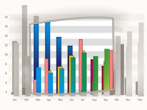
One of the best ways to liven up your presentation is to include a visual aid that helps your audience to be able to “see” just how much their donation will help others. Nonprofits often use images such as photos and videos to help supporters to be able to understand the mission and impact of their work. Visual aids, such as charts, graphs, and infographics can help illustrate the real meaning behind all of the facts and figures and give supporters a more in-depth understanding of just what is at stake.
How to Create Infographics and Other Visual Aids
Creating infographics or other visual aids to help you make your case is not as difficult as you might suspect. Many computers come with word processing and spreadsheet programs, such as Word, Excel and Adobe, that will allow users to create charts and graphs. There are also free and low cost online solutions that can be found with a simple search that will help you to create your own charts and graphs as well. An article published in the online journal Edudemic has some suggestions and links for sites that make it easy to create your own infographics. While the article was published a few years ago, most of the tools listed in the article are still relevant today and can help you to present your statistics in an interesting way that is also easier to understand and remember.
How to Choose the Best Type of Visual Aid to Present Your Data
Sometimes it can be difficult to decide which type of visual aid can best help you to present your data in a way that will earn the response that you seek. Use these tips to help you decide which format might work best for your statistics.
- In general, nearly any sort of data can be turned into an infographic. Sometimes an infographic is really the best way to capture the interest of your audience and build understanding.
- Data from your spreadsheets and tables will usually look the best and be the easiest to understand if it’s turned into a chart or graph. The possible exception to this would be if your spreadsheet data also includes demographic information such as location – in which case a map works great!
- Information that changes over time might be better presented in the form of either a static or interactive timeline.
- If your data is hard to group or classify, presenting it in the form of a mind map can bring both clarity as well as serve as a springboard that spurs others to come up with interesting new concepts and novel solutions.
A Few Last Tips
When creating your visual aids, try to find ways to infuse some personality into the data that you provide. If it’s appropriate for your subject matter and mission, include some humor in your images to make them more fun and enjoyable to read and use.
Don’t limit the use of your infographics and other visual aids to your physical presentations. Include them in your nonprofit’s newsletters, emails, and grant proposals as well as your organisation’s website. Consider converting them to video format and posting them on your YouTube channel and other social media networks to further the reach of your message.
Sharing your visual aid, combined with the traditional images that you post, will only increase the understanding others have of your mission and good work and strengthen your connections with others.

 Posted on 24,Sep |
 Posted by Anne


There are no comments yet